The aim for the project was to create a children’s book cover for a book titled ‘Gracie Gumboots and the Enormous Dandelion Clock’. The design had to be appropriate for a child between five and ten years old. To create the final outcome I found it best to try many different techniques and styles as I could so I could find a style that I found most
interesting. Throughout the process I referred to research in book cover layout, artist references and image making. Although it took a while to find the style I liked best, when I did it was much more interesting to play around with the layout and to experiment with fonts. Overall I am happy with the end result. I can imagine the book set up amongst
similar books for that age group and I feel the cover has some sophistication which makes it work well as an art piece not only a book cover. There were times where it was a little too sophisticated but because the imagery was nature based it was easy to manipulate and make more playful and appealing to a younger audience. I think the colour palette works with the general soft playful mood of the story and the imagery is serious enough to add some mystery too. By making this cover it has contributed to my wider practice as it shows in my portfolio that I can refine my skills into something more designed and controlled. I have learnt how to layout text and images in a minimal way successfully and I have learnt the importance of attention to detail. The choice of recycled paper turned out to be
extremely complimentary to the book aesthetically and conceptually.
FINAL OUTCOME- REMADE THIS DESIGN WITH SPINE
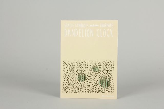
After testing the three covers I decided the cover with the shards of grass and the text along the top works best for the age of the audience. Whilst I am happy with the dandelion it is a little too sophisticated for a childrens book. The white text and the position of the text is more approachable and seems more playful, whereas the vertical text on the other cover is slightly more refined and mature. I remade the final book cover with a spine as it gives the book a more authentic feel and the book seems more complete.
The idea of picking the book from a shelf by only seeing the spine reminds me of my childhood.
It was important to add the spine as I hope to illustrate the whole book and send
it to a publishers. If it were to be bought it would be easy to find it if it were to be
stacked along a shelf.


Book cover final tests
For the outcome I decided to make three different covers. Two only varying slightly and one with a different image. The two dandelion images were made into two covers as I wanted to try it with a soft cover as I was concerned whether the finished illustrated book would have enough pages to successfully fit in a hard back format whilst allowing enough room for the spine to have the title and authors name the way I wanted. Upon reflection the realised that the spine works very well with the design and overall composition of
the book and it is therefore essential to have the hardback.
I chose a recycled 210 gsm paper. The paper
being recycled reflects the nature loving
concept of the story and the texture in the
thick paper compliments the textures in the
image and gives the overall image more
depth.


Different back page, experimenting with colour and elements


Rabbit and Frog
Throughout the process I sketched simple compositions which I could then replicate. I cut out simple shapes from the textures I had made and began layering them
to create images. I tried making a few characters using this technique which I could apply or remove when experimenting with image making.


EXPERIMENTING WITH COLOUR AND LAYOUT
trying bolder colours and different fonts
After much experimentation I chose key elements that I had made from the drawings and cut outs. The key elements that stood out most to me were the shards of grass and the dandelion. The simplicity of the dandelion worked well compostionally and was easy to move around and manipulate. It was clear to the narrative yet didn’t explicitly tell any of the story. The grass in the top images added texture and detail whilst still remaining very simple visually and conceptially.


Testing adding a little frog character
I tried to incorporate a character but actually I prefer it without. I originally didn’t want to use characters but thought id try it out.


Creating images using collage
I painted backgrounds with crayon, paint, promarkers and then cut out shapes

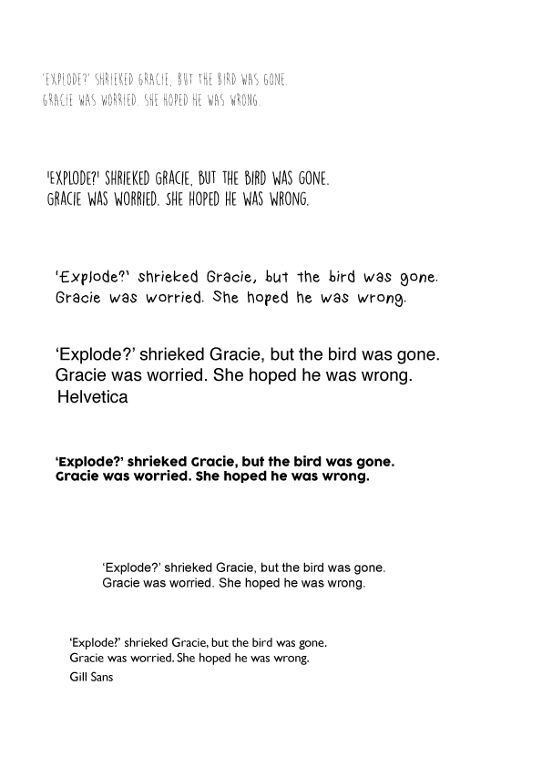
Back cover text and font experiments
Because it is only a short story and I wasn’t provided a blurb I chose to just use a quote from the story that contrasts with the tranquil mood of the imagery to intrigue
the reader. I hoped this may compliment the simplistic imagery and give the reader the role of imagining the world inside the book.